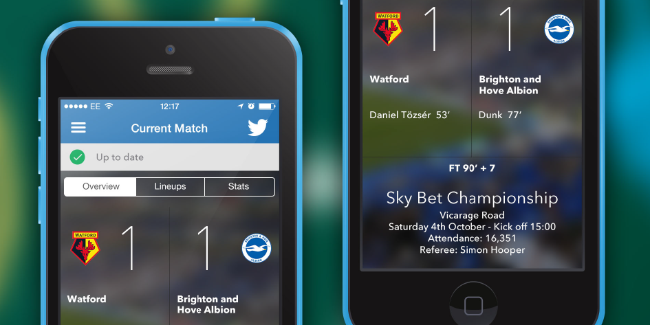
TribeHive is a Brighton-based company offering a novel solution to the problem of poor data connections in public spaces like football stadiums and gig venues. TribeHive have built this cool new technology into the official club app for Brighton & Hove Albion’s football fans – called The Albion. As their Brighton neighbours, we were delighted to help TribeHive give The Albion app a UX refresh.
How does TribeHive’s tech work and why is it so useful? Picture this: on match day, data connections can get overwhelmed because thousands of fans are crowded into a stadium, all hitting their mobile data for news, updates and social networking. Some will struggle to connect, while a lucky few can enjoy a decent data connection. To bridge this digital divide, TribeHive’s HiveCore technology allows users of The Albion to share connectivity with other fans. This means everybody in the stadium can get timely access to the important stuff: real-time stats for teams, players and the match.
The TribeHive team – Jon, Ciaran and Ioannis – know their technology, love what they do, and knew what they wanted to improve.
They came to us with a clear shopping list:
- Update the current match screen
- Improve loading states and progress indicators
- Come up with new ways of displaying statistics
- Design a new formation view
 BRIGHTON & HOVE ALBION APP
@MatchboxMobile part of the delegation visiting Tokyo in the Washington State AI trade mission https://t.co/xGZDPIqCgH
TwitterWe started by familiarising ourselves with the app. Using Ember, we catalogued each screen to see what needed updating.
The original current match screen was a continuous web view. To make it easier to navigate, we split it into 3 – match overview, line-ups and stats. We also suggested going native by making use of common controls, and improving type hierarchy.

During our research, we saw that there is little consensus in apps and on the web on how best to present statistics. We, too, are die-hard football fans, so of course we had our own divergent opinions! In the end, we supplied TribeHive with a graphing toolkit to give them the flexibility to adapt how they presented the information.
We also supplied TribeHive with UX guidance – a cheat sheet to a more satisfying user experience. It’s been satisfying to see our suggestions making it into the product, and we’re looking forward to seeing where TribeHive take the app next.
Jon Rimmer, Director of User Experience for TribeHive, said, “The quality of the materials provided by Matchbox was excellent, and gave us clear direction for the work we needed to carry out.”


