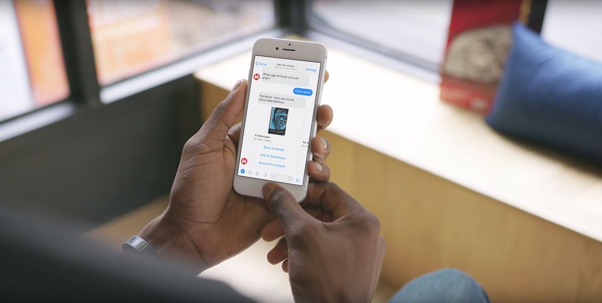
Since Facebook Messenger launched in 2016, big brands like Lego, Dr Oetker, & Sephora have launched chatbots to connect with their customers. These chatbots focus on replicating the in-store shopping experience by using conversation to learn about customer needs before providing accurate product recommendations.
Different contexts demand different approaches to chatbot design. We were lucky enough to work with a major publisher on a book recommender bot. Its purpose: to find you your next great read through a fun, simple Q&A process. Here are three things we’ve learned from our experience designing recommender bots for Facebook Messenger.

Find the right balance between the number of questions and quality of recommendations
As users, we want the right results, quickly. We don’t want to be bothered with too many questions. As a bot builder, more questions can help produce better recommendations, but ask too many questions and users will abandon you. The balance will depend on your user base and what kind of product or service you are recommending. Users looking for health products may be more patient than users wanting to stream a good movie.
You can make the experience of answering the questions less laborious by:
- Using copy that’s more conversational than instructive.
- Adding indications on progress within the copy.
- Adding quick-replies to your questions to make them multiple choice.
- Using carousels within your questions wisely.
- Letting users skip non-critical questions.
User testing with a sample user group, and looking at post-launch analytics, are great ways to refine the experience. Analyze what questions users are skipping, see where users abandon and look at how people react to recommendations. Learn from your users and refine the experience.

Find the best way to present information
Facebook Messenger offers a range of templates for presenting information within Messenger bots. It’s important to know when to use a template, and which one to use.
Consider all the information you need to display, including :
- What is it you need to show the user? Will images help? What titles, descriptions, links, audio are important?
- Do you need to display multiple options for this information at once?
- How would you like the user to interact with the information? Share with a friend, open up a web page, or make a choice to progress the conversation.
It can be tempting to cram the bot full of templates that are overflowing with information, but it’s important to remember that the experience should be conversational. Using templates only where they are required, and sticking to just the elements that are necessary, will create a cleaner experience for the user. If you need to show a lot of different information to help the user make their decision, first show the critical information, then use progressive disclosure or web views to give the user access to the secondary information should they need it.
Encourage users to re-engage
Your bot experience shouldn’t end once the user has their recommendations. You should seek to re-engage in a polite and appropriate way, whether it’s to find out how much a user liked the recommendations, to encourage repeat purchases, or to let users know about new products or offers.
Don’t harass the user! Think strongly about when they’ll be ready to give you feedback or find another recommendation. There is no point asking for feedback after one day if the delivery of the item takes two or three days.
Re-engagement messages should have an obvious benefit; they should guide the user into a new conversation. When designing re-engagement interactions consider how you’d like the user to respond to the message, and how you can keep the conversation within the bot, possibly with the support of web views.
Your users are your best partners in creating and improving a beautiful and useful chatbot, regardless of platform. Hopefully this article has provided you with some insight on what makes a good recommender bot. If you’re thinking of creating a chatbot for your company and want some help, drop us an email at info@matchboxmobile.com


